References

  1. Ishihara, S.  (2012). Acela [Online image]. Retrieved  June 1, 2015 from https://www.flickr.com/photos/nightmeeting/7956080732/
  2. Alpstedt, F.  (2014). Flying [Online image]. Retrieved  June 1, 2015 from https://www.flickr.com/photos/alpstedt/13543319225/
  3. Dorota.  (2014). Cat Model [Online image]. Retrieved  June 1, 2015 from https://www.flickr.com/photos/96972102@N00/14182992815/
  4. Why Do Cats Land on Their Feet?. (2012, June 1). Retrieved May 18, 2012, from http://www.livescience.com/32117-why-do-cats-land-on-their-feet.html
  5. How does a cat land on its legs when dropped?. (n.d.). Retrieved May 18, 2012, from http://www.physlink.com/Education/AskExperts/ae411.cfm
  6. Cat righting reflex. (n.d.). Retrieved May 18, 2012, from http://en.wikipedia.org/wiki/Cat_righting_reflex

* All other icons/images were hand drawn, scanned and then traced.

Summary

Communication Objective
The intended communication objective of this infographic is to break-down and explain the process of the ‘cat righting reflex’. The ‘cat righting reflex’ is the process in which cats use to land on their feet when falling from heights larger than 30 centimeters. The aim of the infographic is to visually represent this process through simple and comprehensive icons, as well as easy to understand text. An emphasis will be made on portraying the information as comprehensive for the average individual who may be searching for information on the internet pertaining to cats.

How This Was Achieved
The initial way in which the communication objective was achieved was by implementing a style of icon which was simple and straight forward. The icons needed to portray the process of a cat falling and the ‘cat righting reflex’ working, and a simple silhouette style was best suited for representing this process and information. Another way in which the communication objective was achieved was through the use of colour. A complementary colour palette utilizing various blue and orange hues was used. Orange was used as an accent colour within the infographic. Colour was also used within the shadows of the text and icons, instead of a plain black shadow. Colour was also used to portray a visual hierarchy which is important for infographics as it helps to organise information and in turn add to the readability of the image. In terms of layout and composition, the elements of the infographic followed a downward flow, starting with the heading/sub-heading at the top, the information within the middle and “extra”, less important information at the bottom. This layout and composition was chosen as it was the most logical choice for the type of information being explained, especially as the information followed a straight forward order. Various elements of typography were also implemented for this infographic. A sans-serif font was used for the heading and subheading, while a serif font was chosen for the body text. The reason that a serif font had been chosen for the body text is that serif fonts are much easier to read, especially when there is a lot of text to process and understand. Using different fonts also defined the visual hierarchy of the infographic when used in conjunction with both layout and colour.


Work in Progress 3

For the past week I have been thinking about layout and composition of my infographic and have come up with some wireframes. I will eventually choose 2 wireframes to develop into concepts this week as well.

Wireframes

I like the first, third and fourth wireframes. In terms of the first wire-frame the heading and subheading are located at the top, then the I will have an outline of a cat with cat facts inside it – outside of the large cat outline will be the process of the ‘cat righting reflex’ which follows a logical order downwards on the infographic. For the third wire-frame, there is the heading and subheading at the top and then for the bottom half of the infographic the ‘cat righting reflex’ process will follow a circular layout around a central/focus image. In regards to the fourth wire-frame, one half of the layout will have the heading, subheading and cat facts. The second half will contain the process of the ‘cat righting reflex’.

Brief 2, Research 5: Composition

Composition is a really important element of any infographic. Composition lets you get creative with the arrangement of your images and text and also helps with the readability of your infographic. One of the ideas I have for the composition of my infographic is to place my information around the formation/outline of a cat – but this is just an initial idea that I will develop later on with some sketches.

I have found some information on composition and layout within info-graphics from ‘piktochart‘, ‘smashingmagazine‘ and ‘1stwebdesigner‘.

  1. A page crammed full of text and images will appear busy. This makes the content difficult to read. It makes you unable to focus on the important stuff too. On the other hand, too much of white space can make your page look incomplete. It is always crucial to remember visually engaging content is usually clean and simple.
  2. When you begin working on a piece of infographic, you should have a story to tell hence, you will need to select a layout that best suits your story. Using the right layout will ensure good readability and convey your message well.
  3. When you have an opportunity to display information visually, take it.
  4. Any time a research number is provided to you for an infographic, ask yourself how it can be visualized.
  5. Wireframing an infographic enables you to work out a storyboard and layout for the design. You may have an idea of the story you want to tell, but as you start laying things out, you might hit a wall and have to start over.
  6. ou could also break up sections with borders, with backgrounds of different shapes or give the entire design a road or path theme.
  7. All good stories have a beginning, middle and end. Infographics deserve the same treatment. At the beginning of the infographic, introduce the problem or thesis. From there, back it up with data. Finally, end the infographic with a conclusion.

From this research, my next task is to wireframe and create thumbnails for possible infographic layout designs. I’m thinking that I may decide to do a vertical composition, but obviously I can play around with my options for composition by brainstorming some wireframes.

Brief 2, Research 4: Colour

colorsss

Image Source Link

Initially, in regards to the colour that will be used within my infographic, I would like to go for a dark and black monochromatic colour palette with accents of blue. The reason for this is because of how blue is associated with air, wind, and falling. These concepts are all associated with the theory of the ‘cat righting reflex’. It would be easy to integrate a complementary colour palette and use orange, but this may be less challenging and orange may not match the overall aesthetic of the infographic. I also have the option of using a blue monochromatic palette for the overall aesthetic but I am currently just keeping this as an option.

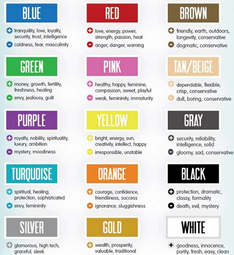
I have found some guidelines for using colour and their meanings within your design from ‘tigercolor‘ and ‘color-wheel-pro‘.

  1. Warm colours are vivid and energetic, and tend to advance in space.
  2. Cool colours give an impression of calm and create a soothing impression.
  3. Blue is the color of the sky and sea. It is often associated with depth and stability. It symbolizes trust, loyalty, wisdom, confidence, intelligence, faith, truth, and heaven.
  4. Blue is strongly associated with tranquility and calmness.
  5. Light blue is associated with health, healing, tranquility, understanding, and softness.

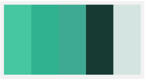
I have also created 4 colour palettes that I may use for my infographic based on my research.

(1) 01 (2)  02

(3) 03 (4)  04


Out of these four palettes, my favourites are numbers 2 and 3. I like palette 2 because it is not completely “blue” and has a tint of green in it, it almost reminds me of a kind of seafoam colour. I also like palette 3 because I find the blue to stand out quite nicely even though it would be used as just an accent colour.

Brief 2, Research 3: Typography

Getting the the style and aesthetic of the writing within my infographic right is essential for helping readers to understand the information that is being conveyed. The typeface, font or even the colour of the text can aid greatly in how information is perceived, understood and overall how the different aspects of the design fit well together together to form a harmonious aesthetic. I’ve come across three websites which offer guidelines for getting the typography of your project right. The information included is sourced from ‘smashingmagazine‘, ‘creativebloq‘ and ‘designschool‘.

  1. Creating a visual hierarchy is important to differentiate between the content in your project. Making sure to add main headings, sub-headings and body helps to understand the content and information being conveyed.
  2. Make sure to choose typefaces that are aligned with your content.
  3. Take advantage of type characters and symbols. If you are faced with a type character such as an ampersand then play around with it and try and make it a feature of your design instead of just a way to separate text.
  4. The easiest and simplest way to make something look elegant and sophisticated is to go small. Smaller typefaces help convey this style.
  5. Use leading, kerning and tracking to make sure that your text can be read and understood properly.
  6. Always keep legibility in mind when selecting typefaces – your information has to be able to be read by everybody.
  7. Don’t match your typefaces too much. Choose typefaces that compliment each other but remain unique enough that your design doesn’t look like it has inconsistencies.
  8. Create variety within your text by changing weight or size, rather than using too many different typefaces.

For my own infographic, I would like to use serif fonts as I feel as if they convey a sense of sophistication and sophistication is a concept that is often associated with cats. Within my infographic, I would like to place more focus on the images rather than the text and therefore a visual hierarchy may not be as important to conveying my information as maybe leading/kerning/tracking may be.

Brief 2, Research 2: Design Inspiration

Catfographic
 ‘Catfographic’
I really like the simplicity of this infographic – especially in terms of layout, colour and icon style. The layout is clear and concise, with bulk of the information toward the bottom of the infographic. I think having most of the information at the bottom is important for keeping the interest of your readers. If you have most of the information at the beginning your reader may lose interest trying to sift through an overload of text and images. I also think the colour palette of this infographic is very complementary, and the colours help to organise the information into different sections. The icon style is also very minimalist which integrates well with the design. From this infographic, I think what I might incorporate into my own is the layout of information.
‘The Healing Power of Cat Purrs’ by Gemma.
I think the visual style of this infographic really fits the topic. It has a very sophisticated and simplistic feel to it. I really like how red is used to highlight the headings of the various pieces of text – this also helps in the readability of the information being conveyed. I also like the fact that, even though this topic relates to cats, the main image of the infographic is a human body. However, the image of the cat is still quite strong and manages to draw your attention in. The neutral colour scheme of the background and the absence of patterns also helps the reader to focus in on the main images of the human and the cat.
‘Stealth Kitteh’
I really like this infographic and how it’s bold in using dark colours. The colours really help in conveying the topic/information convincingly. I also like how the cat is centered in the layout and the information is placed all around the icon of the cat. Like the previous two examples this infographic also uses colours to highlight different sections of information which helps with readability and comprehension for the viewer. I also like how the text information is separated using speech boxes. These speech boxes help in visually representing the information clearly, especially since the colour palette of this infographic very dark and almost monochromatic.

Work in Progress 2 – Information Flow

I think at this point in completion of the assignment, it is important to organise the various steps and bits of information that I will include in my infographic. I’ve just done a little flowchart in Photoshop putting the information into a logical process. The information in orange will be separate from the main explanation of the ‘cat righting reflex’ (and maybe I’ll add some extra cat facts but still not sure about that). This is still a work in progress and the flow of my information may change but it’s at least a starting point to help in organizing how to visually represent the information.

flowchart